
01 AR-Integrated Web Dashboard
An AR-Integrated web dashboard that optimizes information accessibility and enhances interaction simplicity for oil-gas field operators, resulting in up to 50% reduction in inspection time.
UX Designer
12 weeks,
May - Aug 2024
1 UX Designer,
1 Front-end Engineer,
1 XR Developer,
1 3D Visualization Engineer
Domain expertise, project management, interaction design, usability testing
CONTEXT
A cross-platform system for oil-gas experts
SLB oil-gas field operation team leverages Robo-dogs developed by the SLB Software Technology Innovation Center (STIC) Robotics team to conduct daily inspections. The Robo-dogs go on a pre-determined route with about 15 Points of Interests (POIs) in an outdoor field with oil-gas facility. They collected readings from panels and take photos of obstacles to determine if any anomalies arise.

Oil-gas personnel work in complex outdoor facilities, facing high-risk conditions that demand strong expertise, focus, and physical endurance to navigate daily challenges.
The application was a complex cross-platform system (desktop to mobile). To ensure a structured approach, we developed a product roadmap to define phases, align timelines, and distribute design and development efforts effectively.

As shown in the graph, we delegated half of the internship to each platform: the first 7 weeks on research and the web dashboard implementation, and the later 5 weeks for AR development and integration.
FEATURE HIGHLIGHTS
Final Solution Part 1: Web Dashboard for Robo-dog Data Access and Team Collaboration
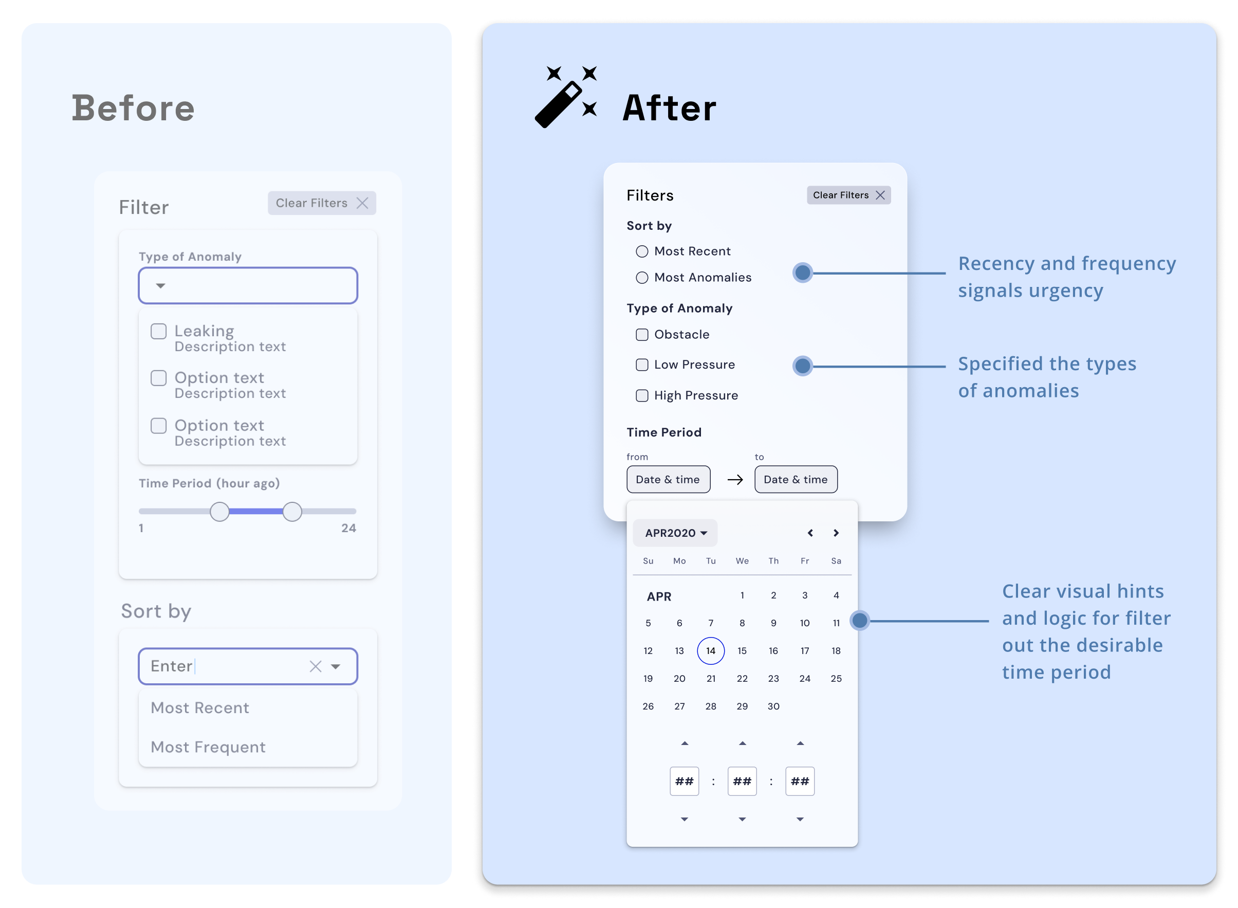
Users can filter by recency and frequency to locate a trip that requires immediate attention, ensuring timely intervention and efficiency

Operators can track Robo-Dog’s activities, analyze routes, and review captured visuals, using tabs to focus on specific anomalies for better decisions

Reviewing team messages provides a shared understanding, enabling personnel to make informed decisions and effective resolution with contextual historical data

THE CHALLENGE
Building a centralized digital tool from 0 to 1
Despite the Robo-dogs' widespread use in the oil-gas industry, including SLB, there is no centralized digital tool for displaying and accessing the collected data when SLB operators are physically on the facility. This resulted in 3 key challenges:
Therefore, SLB wanted STIC research center to build a system that:
RESEARCH
Understanding the requirement and users needs
At the start of the internship, we received brief with preliminary research outlining user profiles, prototyping resources, and the technologies needed for development from stakeholders.
Normally, an oil-gas field has 10+ types of Points of Interest. For the MVP, we considered 2 types of Points of Interest: cones and gauges, for the sake of testing and cost-efficiency.

Each Point of Interest has a QR code attached to it, which is the same as the set-up in the real oil-gas field. Using our research center as the main testing site, we put about 10 Points of Interest around the 1st floor. The Robotics team helped us preset a route that the Robo-dog goes on in the determined areas.

Building on foundational research, we focused our interviews on uncovering specific challenges in field operations and maintenance workflows. I interviewed two field operators and two maintenance technicians to understand their inspection processes, tools, and key needs.
Field operators conduct daily inspections with Robo-dogs, while maintenance technicians address identified anomalies, making their roles closely interconnected. I constructed these personas to help me reinforce users’ key needs in the entire process and make feature prioritization decisions.


We chose Augmented Reality (AR) for this scenario in oil-gas facility sites for two key reasons:
I specified the design brief as below:

DESIGN BRIEF
How might we make Robo-dog data more accessible for oil-gas personnels and enable them to carry out tasks efficiently through an AR-integrated web dashboard system?
FEATURE PRIORITIZATION
Weighing feasibility and impact
To balance ambition with feasibility under tight timeline and technical constraints, I used a feasibility/impact matrix to prioritize essential features for the MVP. Leveraging AR’s potential and user research insights, the XR developers and I advocated for key interactions like annotations and optimal route navigation to enhance real-time actions and team collaboration.

INFORMATION ARCHITECTURE
Laying out the product logic
Given the complicated cross-platform features, I structured a diagram for information architecture to illustrate the logic clearer.

After tons of research, meetings, and planning...
Let's dive into the design process!
DESIGN DECISIONS
Iterating wireframes from 0 to 1
There are two main pages in the web dashboard: Trip Overview & Trip Details. I iterated on several layouts for each page to find out an intuitive display, and improved the wireframes through internal reviews with the PM the front-end engineer, and Robotics team.

During the internal review with the PM and the Robotics team lead, we finalized information to display on the overview page and aligned on iteration #3 -- Card View.

After deciding the layout, I dived into designing key features with higher fidelity.
For each card, I focused on clear information hierarchy that allows users to get a quick grasp of key information. I brought in icons, different fonts, colors, and boldness for respective functional text.

After selecting a trip, users will be directed to the page with details of all the Points of Interest. The information needed to display on Trip Details page for User Flow 2 include:
- Trip Overview
- Task Log
- Points of Interest list
- Anomaly details (Map+Photo)

I then focused on iterating the Points of Interest section.
I explored several design patterns and landed on "Tab" layout, as it visualized the different types into clear, distinguishable categories.
I also decided to move the "Launch AR" button to the Overview section.

REFLECTION
What did I learn?
It was lots of fun collaborating with front-end engineers, XR developers, and 3D Visualization engineers, as everyone thinks so differently and bring unique skills into our project.
However, different ways of thinking and focus also imposes many challenges. I realized the engineers tend to overlook user needs and the "why" of each feature. Therefore, I had to advocate for our users' critical needs during lots of technical discussions, reminding them and highlighting the importance of design choices.
While I care for users as the sole UX designer, I learned about the technical capacity from engineers and business impact from PM and stakeholders. It was rewarding to witness we managed to build the MVP to a complete prototype that satisfy needs and expectations of different stakeholders.


